
Introduction: Redesigning a Website Without AI
Hi all!
I hope that you are doing well and enjoying your day. As some of you have already realised, I have changed my website design. I aim to make it more readable, enable dark/light modes, and minimise CSS definitions so I can further focus on the content.
AI Website Builders vs Hand-Coding
This blog is about AI. Naturally, I wanted to redesign it totally with AI. So I considered several automatic website builders that are available today:
-
wix.com offers users the option to either utilise its AI site builder or choose from various themes, with the AI builder being the quicker choice. Additionally, having the ability to customise the content further using Wix’s mature feature set enhances the overall experience, combining the speed of an AI site builder with advanced editing capabilities.
-
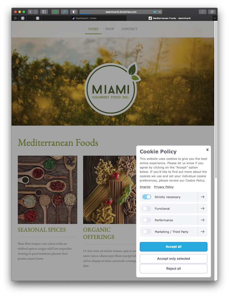
jimdo.com is a strong choice for creating personal or business websites, offering an AI-powered site builder that enables quick startup and essential features for website management. While most customisation occurs in the regular site editor, it ensures a faster process of building a modern website.
-
Unbounce.com is a fantastic tool for creating website landing pages. It can also generate draft copy from a description of your business, similar to their AI-powered copywriting app.
These AI-powered website builders are good. For instance, jimdo.com allows a swift website creation based on templates and provides friendly cookie management, and deployment, among other lovely features.
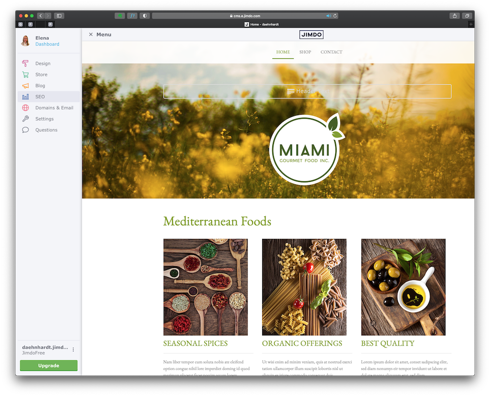
Jimdo, deployed website
Please notice that even though I like food and cook reasonably well, I am not associated with any food service located in Miami :) This is a template in the jimdo.com website generator.
Why did I end up writing CSS and HTML layouts? In this blog post, I will describe the redesign process in detail. I needed a custom solution that creates a simple CSS and HTML layout that fits precisely my blog structure.
Even though we can use AI website generators such as wix.com or jimdo.com, it is often the case that we need to redesign an existing website, and such tools are not yet available, to the best of my knowledge. Please let me know if I am wrong.
Should you develop your website with WordPress, you can check the 10web.io. It can be used to create and host websites with AI. You can feed it with your website URL.
Website Redesign Objectives
Let’s begin by setting up my website redesign objectives. I wanted to have the following:
- A readable font that is defined for all elements using CSS;
- A responsive layout that works reasonably well across different devices and screen sizes;
- A responsive top menu such as realised in Bootstrap;
- CSS code for creating dark and light modes as set on the user device;
- tables of contents are automatically created for all my posts;
- CSS styles defined for my blog post entries;
- CSS for responsive images that zoom in on hover;
These were the main issues I covered in my post. I will use chatGPT and other AI tools to realise these objectives. I will share the results in CodePen.
Since the post is going to be immense (I have some complaints from a few of my readers that my posts are too large, please write me if you want me to write short posts too), I will omit some small things that are are not covered, but done in practice.
The main idea of this little project is to create a website with AI! Let’s go into it!
Using ChatGPT for Web Design (CSS and HTML)
ChatGPT is a conversational AI assistant built on OpenAI’s GPT language models that can generate HTML, CSS, and JavaScript from natural-language prompts. ChatGPT is one of my favourite tools. Even though its language model is trained on the data before 2019, it works well for my purposes. I want to create decent HTML and CSS code.
Next, I used the seven objectives above and converted them into seven prompts for chatGPT, asking it to write me HTML, JavaScript and CSS code where applicable.
Setting Fonts for HTML Headers and Body Text with CSS
Write me CSS code for HTML headers and body text. The font family and size should be readable and defined for all elements using pure CSS
Sure! Here's a CSS code snippet that defines the font family and size for HTML headers (h1 to h6) and body text:
/* Font family and size for headers */
h1, h2, h3, h4, h5, h6 {
  font-family: "Helvetica Neue", Arial, sans-serif;
  font-size: 28px;
}

/* Font family and size for body text */
body {
  font-family: "Georgia", Times, serif;
  font-size: 16px;
}
Building a Responsive HTML Layout with CSS
Create a responsive HTML layout that works reasonably well across different devices and screen sizes. Attach the created external CSS style file
Sure, here's an example of a responsive HTML layout that should work well across different devices and screen sizes. I'll include the CSS in an external style sheet and link it to the HTML file:
See the Pen Responsive Layout by edaehn (@edaehn) on CodePen.
In this example, the CSS styles have been organized to create a simple responsive layout. The layout includes a header with a navigation bar, a main content section, and a footer. The styles have been adjusted to work reasonably well across different devices and screen sizes. The use of relative units (such as em, %, and vw) would further enhance responsiveness, but this basic example should already provide a good starting point.
Building a Responsive CSS Navigation Menu
Add a responsive top menu such as realised in Bootstrap
To create a responsive top menu similar to what you might achieve with Bootstrap, we'll use media queries and flexbox. Flexbox allows us to create a responsive layout with flexible and easily adjustable elements. Here's the updated styles.css file:
See the Pen Allegedly responsive menu by edaehn (@edaehn) on CodePen.
In this updated CSS, I've added a media query to apply responsive styles when the screen width is 600 pixels or less. This will make the navigation links stack vertically and center them in the header on smaller screens. Now your top menu will behave responsively and adjust its layout based on the screen size. It will be horizontally displayed on larger screens and stacked vertically with centered alignment on smaller screens. You can further customize the styles based on your design preferences.
Elena: The navigation links did not stack vertically. Rewrite the code to be responsive for screens width 600 px or less.
Apologies for the oversight. Let's modify the code to make the navigation links stack vertically for screens with a width of 600 pixels or less:
With this updated CSS, the navigation links should now stack vertically when the screen width is 600 pixels or less, making the menu more responsive on smaller screens.
Quite sad, but the links did not stack vertically once again.
See the Pen Website redesign with AI by edaehn (@edaehn) on CodePen.
Implementing Dark and Light Mode with CSS and JavaScript
Rewrite the CSS code for creating dark and light modes as set on user device
To create dark and light modes based on the user's preference, you can use CSS Variables (Custom Properties) and JavaScript to detect and toggle the mode. Here's an example of how you can achieve this:
In this setup, we define CSS variables for the background color and text color based on the user's system preference for dark mode (prefers-color-scheme: dark). When the user clicks the "Toggle Mode" button, JavaScript will add or remove the dark-mode or light-mode class from the HTML element, allowing the appropriate CSS styles to take effect. You can add the rest of your styles to the styles.css file, and they will automatically adapt to the dark and light modes as set on the user's device.
See the Pen Dark/Light mode using chatGPT by edaehn (@edaehn) on CodePen.
It is interesting that it did not use the localStorage to keep the selected mode. However, the generated code is quite useful for learning how it is done. I would also recommend w3schools, How TO - Toggle Dark Mode
Generating a Table of Contents
Write a JavaScript that reads in HTML contents, gets H1 and H2 headers, and writes a table of contents automatically using numbered lists.
Sure! Here's a JavaScript function that reads the HTML contents, extracts H1 and H2 headers, and generates an automatic table of contents using numbered lists:
In this example, the JavaScript function automatically generates a table of contents (TOC) in the "table-of-contents" NAV element. It reads the HTML contents, extracts H1 and H2 headers, and builds a nested numbered list based on the hierarchy of the headers. When you load the page, the TOC will automatically reflect the structure of the document. You can adjust the script to include more levels of headers (e.g., h3, h4, etc.) if needed.
The result was incomplete.
See the Pen TOC with chatGPT by edaehn (@edaehn) on CodePen.
If you are curious, try running these prompts, which might give insufficient code-quality results but are useful for learning helpful functions and approaches.
CSS for blog posts
Define CSS style for my blog post entries
Certainly! Here's a basic CSS style for blog post entries. You can further customize it based on your design preferences:
See the Pen CSS for blog posts by edaehn (@edaehn) on CodePen.
To use this CSS style, you can add a class "blog-entry" to each blog post entry container, and then add appropriate HTML structure for each blog post entry.
Repeat the above structure for each blog post entry, and the CSS styles will be applied accordingly. This is just a starting point, and you can add more styles and elements as needed for your blog layout.
CSS Hover Zoom Effect for Images
Write CSS for responsive images that zoom in on hover. The images should fit the screen for various devices and screen sizes.
To create responsive images that zoom in on hover and fit the screen for various devices and screen sizes, we can use CSS transitions and the object-fit property. Here's the CSS code:
See the Pen Responsive Images that Zoom by edaehn (@edaehn) on CodePen.
In this example, we create a responsive image container (.image-container) that wraps around the IMG element. The object-fit: cover; property ensures that the image scales proportionally to cover the entire container and does not distort its aspect ratio. The overflow: hidden; property hides any image parts that might overflow the container. On hover, the transform: scale(1.2); property is applied to the image, which zooms it in by 20%. The cursor: zoom-in; property sets the cursor to the zoom-in icon to indicate to users that they can zoom in by hovering. You can customize the zoom level by adjusting the scale value in the .image-container:hover img selector. The .image-overlay class is optional and can be used to add an overlay on top of the image when zoomed in, which can be useful for aesthetic purposes or to display additional information. Remember to adjust the HTML accordingly, for example:
<div class="image-container">
  <img src="path-to-your-image.jpg" alt="Image Description">
  <!-- Optional overlay div -->
  <!-- <div class="image-overlay"></div> -->
</div>
Now, when users hover over the images, they will smoothly zoom in by 20% and fit the screen for various devices and screen sizes.
The result was also fair, and I might adapt this technique to my website. You can check the CodePen with an image from one of my blog posts The Remarkable Evolution and Milestones of AI.
You can check the whole chatGPT-generated content with a few changes in the last pin in my CodePen Collection: chatGPT generations .
The Manual (Human) Redesign Process
To be fair, my front-end skills are minimal. I am more into back-end development. Nevertheless, I have changed the CSS and HTML layout with chatGPT, CodePen, w3schools, and some practice. AI was helpful, but we must still do and test the messy work.
Tools I have used
This website is static. Thus, I use HTML, CSS and JavaScript without server-side code (for instance, PHP). All of this is made possible with GitHub pages that allow me to compile Markdown files and provide me with a great hosting environment where I do not care about necessary updates compared to WordPress hosting with its many plugins.
It is okay to have many plugins; they provide great functionality, as I know from my own experience of using WordPress. However, the main requirement for my blog was minimalism and easy maintenance. The GitHub pages were the best fit.
How do I enable form submissions on a static website? I use UseBasin.com for years, and I have just started my affiliation with them.
Fixes
Initially, I used an elementary template to generate my blog, and then I started developing my style and page layouts. All of these became cluttered, and I did not like it. The pages could have been more responsive and sometimes loaded slowly.
There were many fixes, including:
- Top menu and pages layouts are responsive to user screen sizes;
- Adapting to user screen light or dark modes;
- Some images (such as performance graphs) are not zoomable on hover;
- The automatic TOC generation;
- Fonts changed with readability in mind;
- Input fields (contact and subscription pages) responsive and well-behaved :)
- Added a simple JavaScript search on my main blog page;
- Added small thumbnails for all blog posts (there is a default image when the blog post does not have an assigned image). The thumbnails disappear for small screen sizes;
- Few corrections for code blocks;
- Fewer colour blocks, more content!
Visuals
Naturally, I use Midjourney and similar tools to generate images and thumbnails for my blog posts. I must compress the generated pictures and resize them for faster page loads. You can read these blog posts about using Midjourney if you are interested:
Testing the Responsive Website Design
I wanted to test and, if needed, fix any performance issues on my website. I have checked the performance using these tools:
-
Yellowlab.tools used to test my CSS, found some @import issues and fixed them. Yellowlab.tools is convenient since it gives a list of issues and tips for correcting them.
-
Cssstats.com provides CSS analytics and the CSS specificity score, which should be the lowest for easier CSS maintenance.
-
W3C CSS Validator, which is also reffered by Yellowlab.tools, provided CSS errors to be fixed.
-
CSS Optimizer Share helps to optimise CSS by compressing colours, font weights, removing invalid properties and other useful options.
I will still improve the design and add more exciting AI tests. I like to try out new AI tools. Write to me if you have one in mind. Thank you very much for your messages. They make me happy!
Conclusion: Why I Hand-Coded Instead of Using AI
Although chatGPT writes CSS and HTML code with self-assured confidence, the outcome must be accurate. You will need to adapt and fit the GPT-generated code into your project. You can generate code snippets with chatGPT and update your skills while learning how to code, mostly yourself, which is always great! Additionally, we can use out-of-box solutions that build websites with AI or templates. However, all of these require human efforts yet. AI website builders and code assistants are accelerators, not replacements: they generate first-draft CSS and HTML that still require human review, testing, and adaptation.
Did you like this post? Please let me know if you have any comments or suggestions.
Posts about building websites and SEO that might be interesting for youReferences
7. CodePen Collection: chatGPT generations
Enjoyed this? Get more like it.
Weekly notes on AI tools, Python, and what I'm actually building — plus a free copy of Fantastic AI: The 2026 Toolkit.